SHARP THISTLE HOTELS
In the early 1990's I reproduced in paint on canvas a series of advertising posters showing music gigs etc., that appeared on hoardings around Dublin's city centre (fig 1). I liked the variety of effect these posters achieved using one or two colours -including graphics and words presented in different sizes and typefaces plus photographic images -which I reproduced on my canvases with a chiaroscuro technique. As well as the logos of rock groups I reproduced in paint corporate logos as they appeared on premiership football shirts (fig 2). The random juxtaposition of these logo designs on long established football kit designs made for an interesting visual irony while maintaining a flat unmodulated and saturated colour technique. After venturing into producing some text-based works I reduced the words to letters and then to the letter L. The letter L's angular nature allowed it to be reproduced in different sizes and tones to produce an interesting pattern that can be painted in a crisp colour technique.
Graduating in fine art from the Crawford in 1981 my work instinctively reflected the art ideas of the time represented by movements such as firstly The Pictures Generation and then Neo-Geometric Conceptualism. Today I see my work grounded in concepts originating in these movements. Neo-Geo artists created artworks that were influenced by the style of earlier developments in twentieth century art –such as Minimalism, Pop Art, and Hardedge Abstraction. Grace Glueck, one of the key documenters of the movement, notes “The painters among the Neo-Geo movement consciously recycled geometric motifs of the 1960's and 70's in their canvases, but put them to new use, regarding their geometry as referential rather than abstract.”
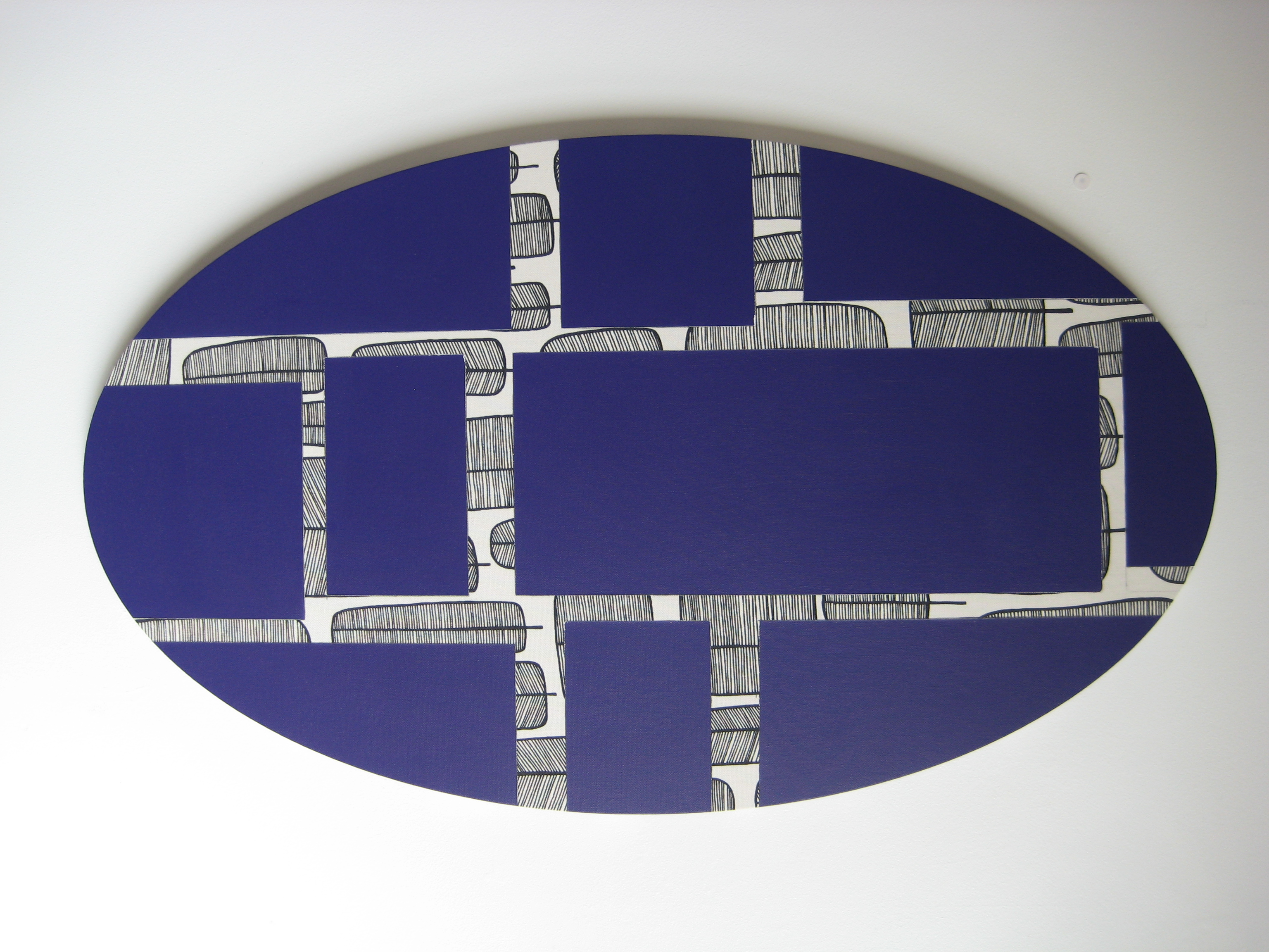
Currently I'm interested in the period between Mondrian and Minimalism, the Neoplastic followers of Mondrian and the Abstract Classicists. Ilya Bolotowsky 1907-1981 for example developed Neoplasticism after the death Mondrian. Two main areas where he departed from Mondrian were his palette and his use of circular and oval supports/stretchers. By very much broadening his palette (Mondrian only used red, yellow, blue, black, white and grey) Bolotowsky broadened the language of Neoplasticism and made it the language of juxtaposing unmodulated coloured squares and rectangles. Bolotosky's subtle colour schemes softened this rigid geometry, as did his use of circular and oval stretchers. Painting squares and rectangles on circular and oval stretchers was counterintuitive in the race to the reductionism that became minimalism. The blank canvas of minimalism tended to become clinical and sterile and a dead end for painting. Bolotowsky's approach suggests an alternative path for formalist painting a way to avoid reductionism.
Raw canvas became an anchoring element in my paintings. The colour of cotton became the first colour of my abstract compositions (fig 3). However, the question inevitably arose; why restrict oneself to painting on cotton canvas when there were lots of other fabrics that could be painted on? I began to paint my hardedge geometric designs on pre-printed fabrics from haberdasheries and soft furnishing suppliers. This juxtaposing of painted form and patterned textile created an exciting visual incongruity. The variety of printed fabrics available to me warranted their own study, and I began to see the potential of cloth material coming off a roll with the same possibilities as paint squeezing out of a tube.
Curtain and upholstery fabrics proved more useful than more tenuous cloths. Studying this material led me to study the synergies and parallels between non-objective paintings and decorative curtains. Both employ various colours, designs, and forms on fabric. The major difference between these soft furnishings and paintings besides their function is that the fabric on paintings is stapled onto wooden frames while curtains hang from poles. This difference needed scrutiny as does the prestige of fine art painting versus the lowliness of decorative curtains.
My works explore the topographic nuances of consumer culture, the vagaries of taste in the use of found fabrics from domestic interiors and the rotations of fashion and obsolescence. The oval format I use underlines the physicality of my paintings which rely on a subtle rather than an impasto expressionism. It also references the quaintness of modernist abstraction; the utopian belief in new promises and shapes of the future, a future that certainly cannot be taken for granted any more (fig 4).
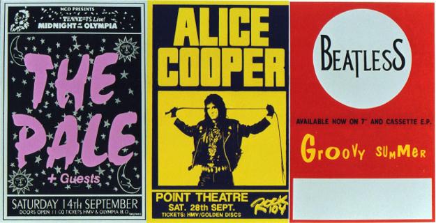
Fig 1. 3 Posters, Acrylic on Canvas, 1991, 152 x 300 cm
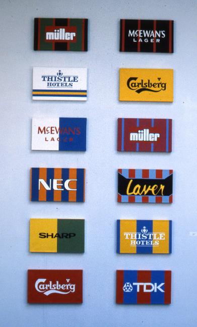
Fig 2. The Sponsors, Acrylic on 12 Canvases,1995, 267 x 132cm overall.
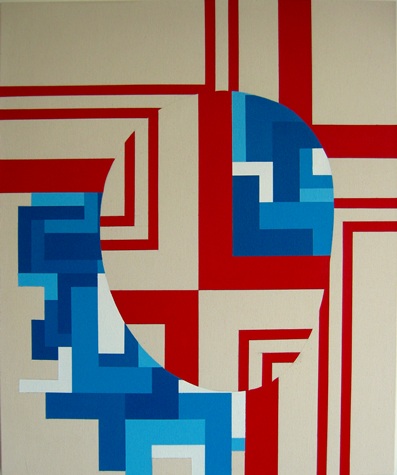
Fig 3. Untitled, Acrylic on Canvas, 72 x 60cm 2013